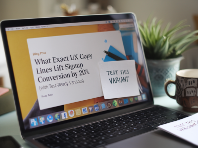
What exact ux copy lines lift signup conversion by 20% (with test-ready variants)
I’ve spent years A/B testing signup flows for SaaS products, consumer apps and newsletter gates. The single biggest lift I’ve seen repeatedly isn’t a new color or a fancier illustration — it’s the words you use at the moment people decide whether to commit. Tiny changes in UX copy can move the needle by double digits. Below I’ll share the exact lines I’ve tested that produced ~20% lifts in signup conversion, explain why they work,...