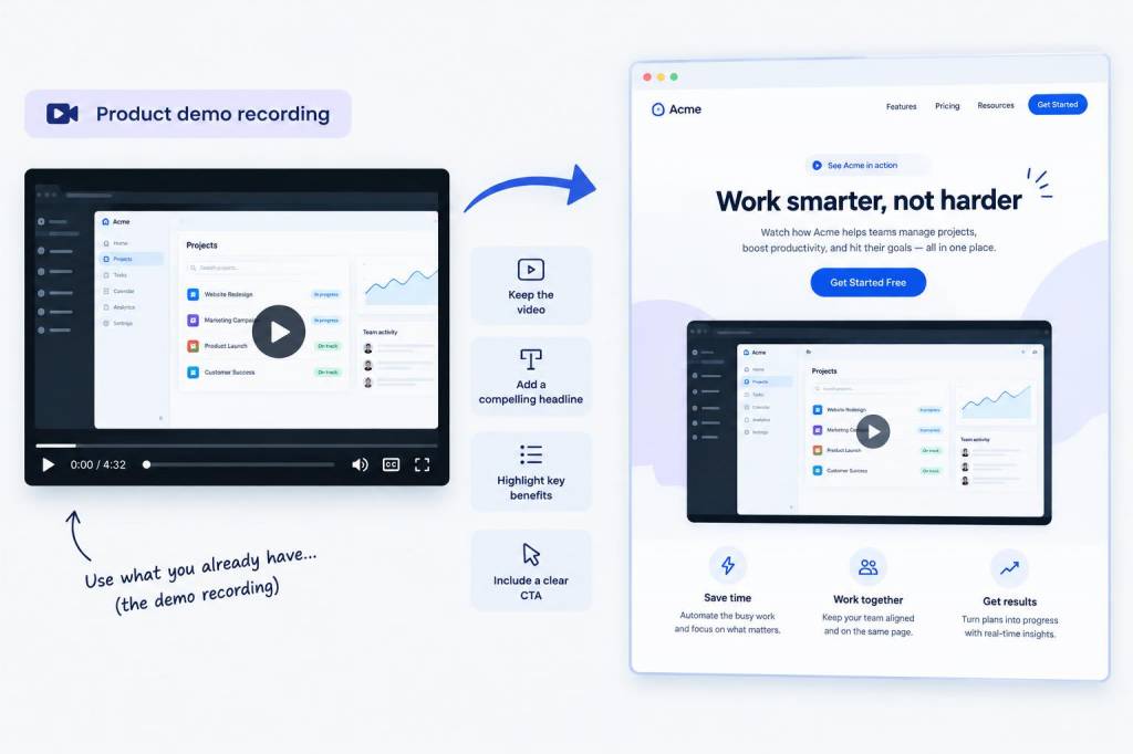
Most product demo recordings are useful, but few are ready to work hard on a landing page without some editing. I have seen plenty of teams treat a demo video as a finished asset when, in practice, it is only raw material. A strong landing page does not need a full rewrite of every message, every visual, or every proof point. What it needs is structure, pace, and a clear path from curiosity to action.
When I turn a product demo recording into a landing page asset, I start by asking a simple question: what does a visitor need to understand in under a minute before they feel ready to click, scroll, or sign up? That question shapes everything. Instead of rebuilding from scratch, I pull the strongest moments from the recording and arrange them into a page that feels focused, credible, and easy to act on.
What I look for in a demo recording
I never begin by writing page copy. I begin by reviewing the recording like a visitor would. I want to find the moments that already carry energy, clarity, or proof. A good demo usually contains more material than you need, which is a good problem to have. My job is to remove friction, not invent a new message.
During review, I usually mark four kinds of moments:
- Clear product outcomes, where someone shows a result instead of describing it
- Feature explanations that are easy to grasp in one sentence
- Proof points, such as speed, savings, accuracy, or workflow improvement
- Natural reactions, such as a laugh, a surprised pause, or a moment of relief
I also look for weak sections. These are not failures; they are editing signals. Long setup, internal jargon, repeated explanations, and anything that assumes too much context usually belongs in a shorter version or off the page completely. A landing page is not a webinar replay. It is a conversion asset.
My rule for keeping copy changes small
If I can keep a line from the recording and make it work as on-page copy, I do. That keeps the page honest and saves time. I often trim rather than rewrite. A demo that says, “We built this so teams can move faster without losing control,” can often become a headline, subhead, or supporting statement with only light adjustment.
I like this approach because it preserves voice. If a recording sounds human, the page should sound human too. Overwritten landing pages often feel polished but empty. Reused language from a real demo tends to feel grounded in actual product use. That matters because visitors are not only evaluating features; they are judging whether they trust what they are seeing.
When I do need to rewrite, I stay close to three things: intent, tone, and proof. I will change sentence shape, but I avoid changing meaning unless the original phrasing is vague or too internal. If a line is too long for a landing page, I split it. If it is too abstract, I attach it to a visible outcome.
How I structure a page around a recording
I usually think of the page as a sequence of attention shifts. Each section should answer a different question without repeating the one before it. A landing page built from a demo does not need to mirror the full recording order. In fact, it usually performs better when it follows the visitor’s decision process rather than the presenter’s script.
My preferred structure is simple:
- A clear opening promise
- A short visual or clip showing the product in action
- A benefit section that translates features into outcomes
- A proof section with numbers, logos, or use cases
- A friction-reduction section that answers common doubts
- A single action prompt placed where intent is highest
This structure works well because it lets me reuse material efficiently. A strong opening line from the recording becomes a headline. A product moment becomes a hero clip or GIF. A customer quote becomes proof. A feature explanation becomes a benefit block. I am not reinventing content; I am reshaping it for a new job.
What I cut without hesitation
One of the most useful habits I have developed is learning what to leave out. Demo recordings often include too much context, too many transitions, and too much product history. Visitors on a landing page do not need a full origin story. They need relevance.
I usually cut:
- Internal team chatter that does not help a visitor understand value
- Long introductions that delay the first useful point
- Repeated feature walkthroughs that say the same thing in different ways
- Side comments that are interesting but not conversion-friendly
- Technical detours that can live on a support or documentation page instead
Cutting content is not about making the page thinner. It is about making the message sharper. A landing page with fewer ideas can outperform a page with more content if every section pulls in the same direction.
How I turn spoken moments into page copy
Spoken language and landing page copy are not identical, but they overlap more than people think. Demo recordings often contain the exact language a page needs, just in a looser form. I listen for phrases that already sound persuasive, then I clean them up so they read well.
For example, if a presenter says, “This saves a lot of time because you do not have to keep switching tools,” I might turn that into a tighter landing page line such as, Save time by keeping every step in one workflow. That version keeps the promise while making it more scan-friendly.
I also pay attention to cadence. Good demo speakers often use short, confident phrases when they are most convincing. Those phrases often make strong headlines, subheads, callouts, or button support text. If a line sounds natural when spoken, I test whether it still works when scanned on a page. If it does, I keep it.
What I add when the recording is not enough
Even a great demo rarely covers everything a landing page needs. Sometimes the recording shows product value clearly but leaves out objections, comparisons, or implementation details. That is where I add targeted content. I do not add more noise; I add missing reassurance.
Common additions include:
- A short explanation of who the product is for
- A simple use-case section tied to a real audience segment
- A proof layer with metrics, testimonials, or customer names
- A short objection-handling block about setup, learning curve, or integrations
- A clear action block that tells visitors what happens after they click
I find that many teams forget this part. They assume a good demo will sell on its own. It often does not. A landing page has a different job from a demo video. The page needs to remove uncertainty, while the demo needs to create interest. I like to think of them as partners rather than duplicates.
A simple framework I use while editing
When I want to move quickly, I use a four-part editorial pass. It keeps me from overworking the material and helps me stay focused on conversion.
| Pass | What I look for | What I usually do |
| Message | Main promise, core value, intended audience | Trim weak language and sharpen the central claim |
| Flow | Order of ideas, pace, transitions | Move sections into a more logical conversion sequence |
| Proof | Evidence, metrics, examples, trust markers | Pull proof forward and make it visible sooner |
| Action | Next step, button text, form friction | Make the action obvious and low effort |
This framework helps me avoid a common mistake: making the page prettier without making it stronger. A better layout helps, but message clarity and proof placement usually drive the result.
Why video, copy, and layout need to work together
A landing page built from a product demo works well when every layer supports the same story. If the video promises speed but the copy talks about complexity, visitors feel the mismatch. If the design is polished but the page hides the value too low, visitors lose patience. I try to align all three layers so they reinforce one another.
My favorite pages are the ones where the video does not repeat every word on the page. It should add motion, specificity, and confidence, while the surrounding copy does the translation work. That balance matters. Too much repetition feels lazy. Too much variation feels confusing. I aim for a page where each element earns its place.
When I audit a page built from a demo, I ask myself:
- Does this section add new information?
- Does this clip show something faster than text could explain?
- Does this headline reflect what the visitor already saw?
- Does this proof reduce doubt, or just decorate the page?
Those questions keep me honest. They also keep the page focused on conversion instead of content volume.
What usually improves conversion fast
In my experience, a few small changes often make a bigger difference than a full rewrite. I have seen landing pages improve simply because the strongest demo moment moved higher, the headline became more specific, or the form stopped asking for too much too soon.
The fastest improvements usually come from:
- Opening with a clear outcome instead of a product category
- Using a short clip that shows the product working within seconds
- Replacing vague claims with concrete results
- Moving proof closer to the first call to action
- Reducing form friction and removing unnecessary fields
I have also found that small wording changes can change perceived value. A button that says Request access feels different from one that says See it in action. Both can work, but one may fit the intent of the page much better. I like to match the action language to the visitor’s stage of interest.
When I do this well, I am not rebuilding a page from scratch. I am extracting value from a recording that already exists and arranging it in a way that makes decision-making easier. That is usually where the real win comes from: not more content, but more clarity, placed where it matters most.